Creating a cover that is true to the book is just as important as creating something memorable. — Donna Payne, creative director at Faber & Faber
This year, precisely during the 7-week lock-down due to the Corona crisis, I spent a lot of time thinking about book cover design. Robert John Goddart, author of six novels and two novellas, offered me the unique opportunity to re-design all his covers.
I was thrilled and also quite intimidated because I was aware of the fact that “we do, in fact, judge books by their covers all the time. Everything about a book’s cover — the font, the images, the colours — tells us something about what we can expect to find, or not, inside.”, as Clare Thorp pointed out in a recent article for the BBC.
Everything about a book’s cover — the font, the images, the colours — tells us something about what we can expect to find, or not, inside.
Covers do so much more than hold the pages together. Yes, they encapsulate important information, like signaling genre, but actually they can do so much more: They give face to a book’s personality, and ultimately they will be turning the scales towards buying or shelving it.
When I go to my local bookstore to browse through books, I often feel attracted to a certain kind of cover. It is what makes me pick up the book in the first place before reading the abstract on the flip side before deciding whether to buy or not. I treat books like an object, or a piece of art. After all, it’s the covers long after I finished reading that make me keep them in my bookshelf, or dump them.
When I started thinking about the facelift of Robert John Goddard’s books, two considerations had a determining influence on the design process: First, instead of dealing with one single cover, I had to deal with eight. Secondly, I was working with the constraints of a very limited budget.
Both factors together led to the overriding design idea of developing a universal design input for all of his published books in order to narrow down boundless possibilities.
As a result of what first might have seemed limiting choices, my aim was to achieve a memorable and distinctive design for all the books. This was crucial in order to avoid the confusion caused by the fact that there are two authors by the same name. One is called Robert Goddard, and the other Robert John Goddard!
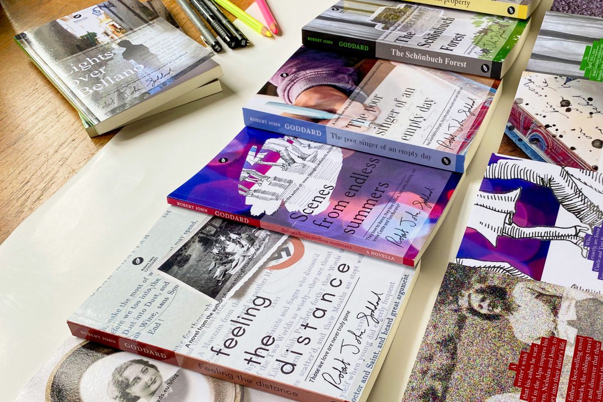
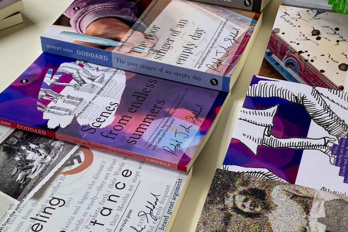
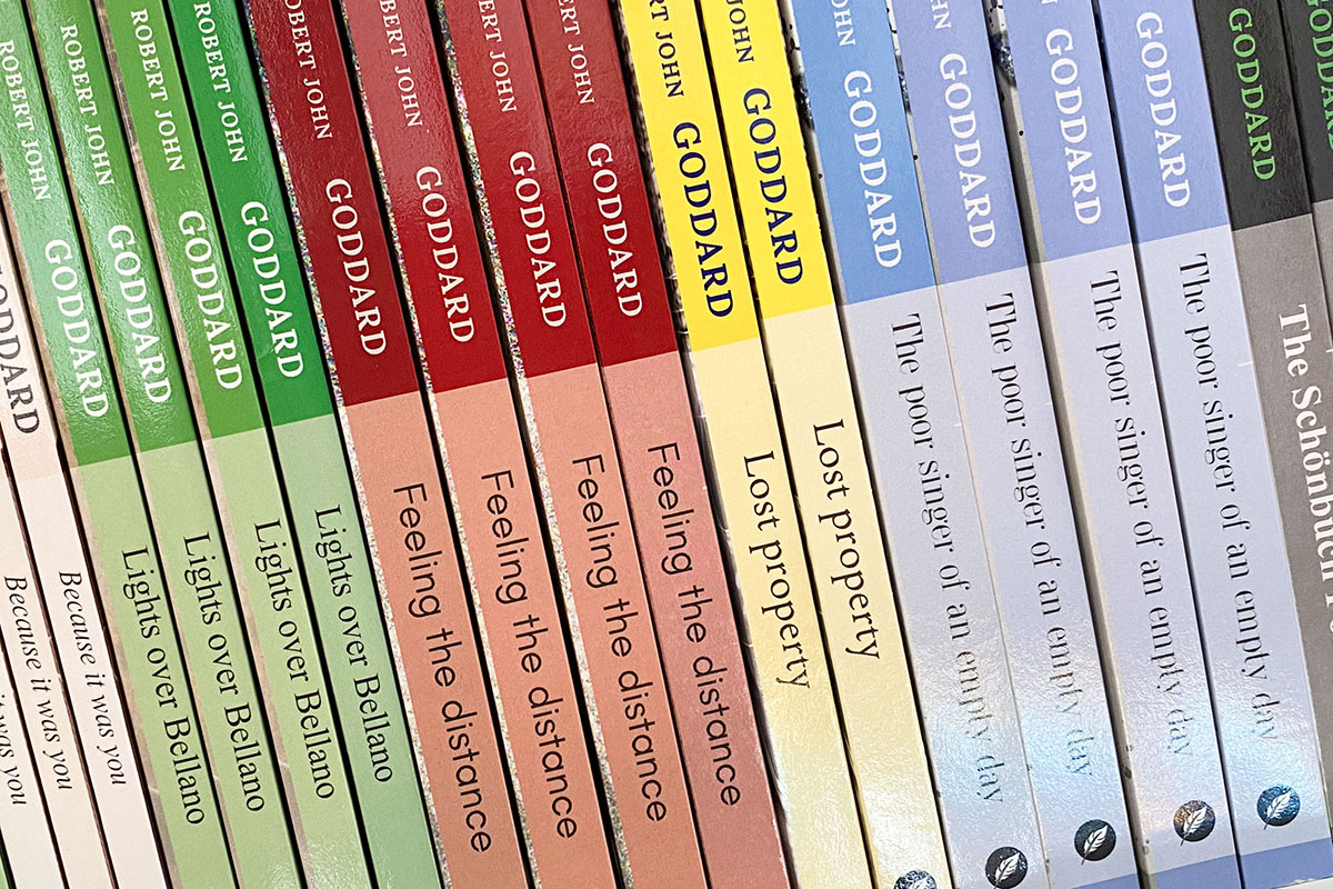
Contrary to the current trend for what Clare Thorpe describes as “brighter, super-saturated covers using fluorescent and special colours and saturated imagery with white-out text in order to match the brightness of screen, trying to make each book stand out on its own“, my idea was to create an imagery that pulled all the books together. I also envisioned a fitted slipcase for the entire collection, using a dash of colour for the spines — green for Lights over Bellano, yellow for Lost property, red for Feeling the distance, blue for the Poor Singer, magenta for Scenes from endless summers, and so on.
All books share the same semi-transparent “sleeve” containing the title, a short subtitle, and the author’s handwritten signature. Another distinctive element to help buyers separate both “Goddards” is a logo I designed to mark the center top of the front cover and on the spine. Generally, the author had a clear idea of what he wanted and what was a no-go! He provided the necessary background information and material, in particular old photographs to illustrate the content and complete the genuine design. Anything we didn’t have at hand had to be created, for example the background images, illustrations and photographs are my own making.
Robert John Goddard’s books are now available as Ebooks, and except for one also as paperbacks. Did I hit the target of designing a good cover? A last word from the author himself:
Andrea has created covers that are not only true to the stories within them, but they also represent the feelings I wanted to convey. She did that by asking the right questions and teasing out the necessary bits and pieces she needed to produce a set of themed cover designs which will certainly enhance the Robert John Goddard brand.